It's one of those boring nights where you can't really sleep so you decide to do something silly just for shits and giggles... And I decided to mock up a redesigned UI for FFXI. :3
First off, some rules:
1. The UI must still reflect the game's theme somehow. (Assuming no actual 3D area graphics on screen, you can still recognize it's FFXI).
2. This is ignoring PS2 limitations (lol)
3. This will assume that the "worst" system is the Xbox 360
4. The UI must still reflect the fact that it is meant to be played with controller, keyboard, and mouse.
5. The UI can display more data but cannot go beyond a certain reasonable limit
6. The UI is meant to be displayed on TVs and Monitors.
With all that in mind, lets look at the game itself with nothing on it.
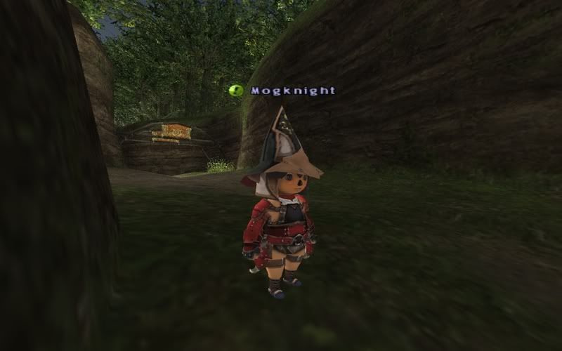
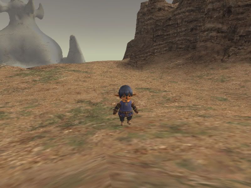
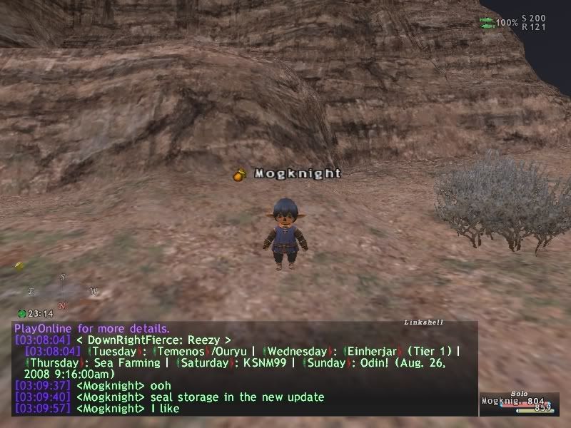
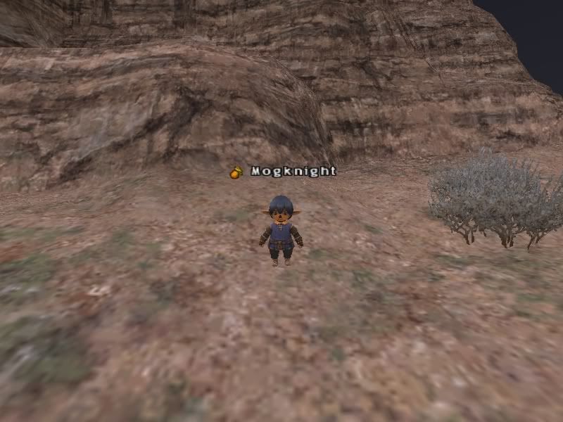
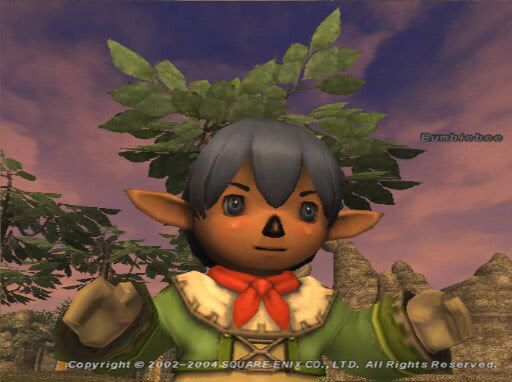
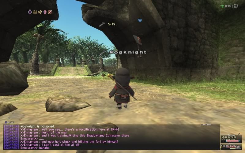
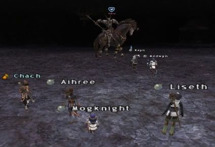
So, we see a Taru (me :3) in Tahrongi Canyon and there's absolutely no overlay or anything. This is 800x600, which is bigger than your standard TV resolution (I think it's like 720x480?). Not counting the fact that it's all interlaced and whatnot, lets work with 800x600.
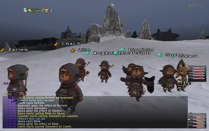
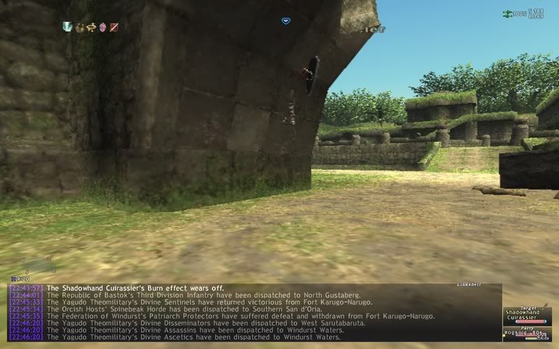
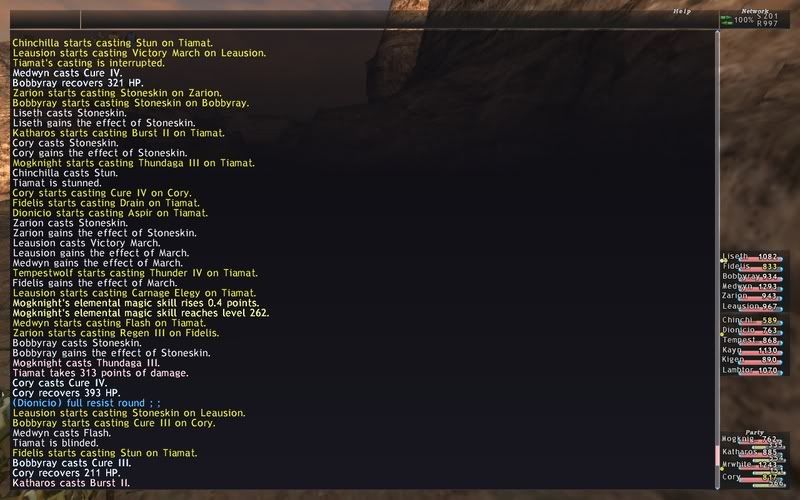
First thing's first, lets look at the current UI (note that this has FFXI Style's dat mods so text and stuff that you see right now may not reflect your current screen!)
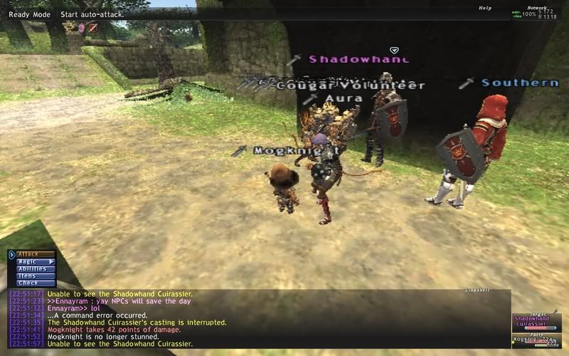
This is the bare screen that you see without having any menus on.
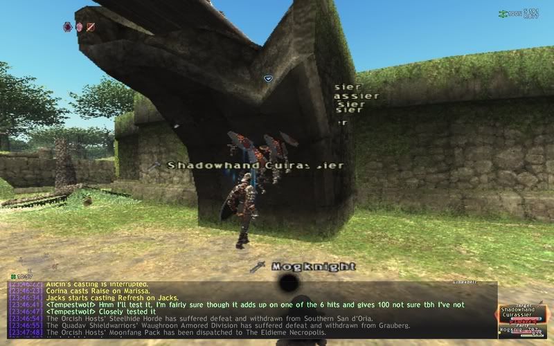
Here it is without the overlay.
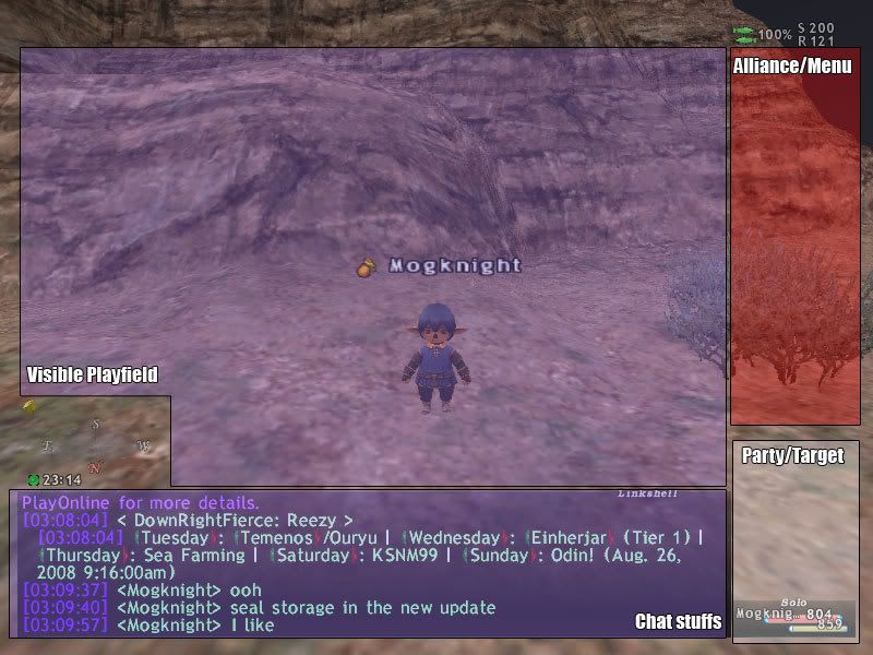
Lets analyze the overlay a bit (btw my mouse sucks right now)
Again, this is just the area that you can visually see without menu obstructions but I tossed in the things that are going to be on constantly. As more and more menu items appear though, your vision becomes more obstructed. Thankfully this isn't the resolution I normally play at so I can view more things even with all the menus open.
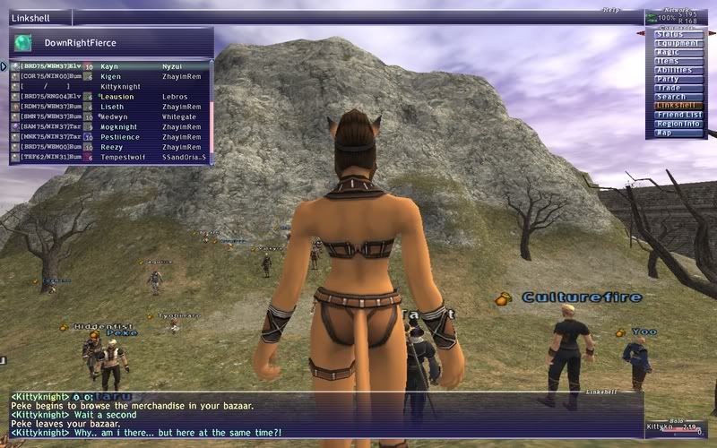
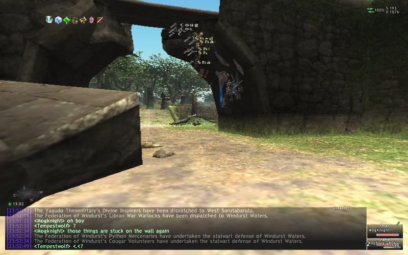
This original image was 1280x800 (downsized due to Photobucket). As you can see, the higher your resolution, the more open space you have. However, while this can be possible on the 360 version (it can go up to 740p for games, not sure about 1080i or p), this would still put a handicap for those playing on a standard TV or a underpowered machine. Our job is to remove this to the best of our ability~!
First, lets determine what we need that is currently being displayed:
1. Chatlog
2. Character/Party/Alliance HP/MP Status
3. Connection Status
4. Compass
5. Clock
6. Target Info
7. Menus
Next, lets see what we can add to the UI
1. Distance to current target
2. TP information
3. Timestamp for chatlog
4. Moonphase information
5. Various random stuff that we can add
Now, the most important thing we should add first are the menus.
1. Main Menu
2. Action Menu
3. Macros
4. Inventory Menu
5. Status Menu
6. Item List
7. Ability/Spell List
So, we got the main menu... which is split into two menus. In my opinion, that's too damn much. Here is what we have:
Status
Equipment
Magic
>White Magic
>Black Magic
>Songs
>Ninjutsu
>Summoning
>Blue Magic
Items
Abilities
>Job Traits
>Job Abilities
>Weapon Skills
>Ranged Attack
>Pet Command
Party
>Seek Party
>Find Member
>Autogroup
>Languages
Trade
Search (Not even gonna bother listing everything)
Linkshell
Friend List
>To List
>Messages
>Online Status
Region Info
>Conquest
>Besieged
>Campaign
Map
Missions
Quests
Key Items
View House
Bazaar
Macros
Config
Help Desk
Play Time
Current Time
Shut Down
Log Out
Okay... lets try to condense this a bit. There are 24 menu items, 12 each side.
First off, the status menu is used to see you main things: Your XP TNL and your skills, along with your title. Yes, it has your attributes there... but you're not gonna look at it there, it's already in the equipment menu! So, instead of just making a bunch of buttons to display stuff like like that, lets just have your Status Menu display everything. So, no more having to click through crap.
With this in mind, lets put in some other things along with it like the playtime option (which btw 908:22:21:12 as of this writing).
One button gone!
Next, equipment is just fine on its own, so we'll leave that be.
Magic... personally, I don't think magic or abilities should be cast from the main menu. Now, I know that there is the whole Ctrl+M thing to call up the magic menu. This is how I think it should work.
Ctrl+M: Opens the magic list with the magic that you are allowed to cast with your current job.
Action Menu: It functions as the same as Ctrl+M
Main Menu: Magic Sort usage only.
With the magic sorting, it would go straight to manual sort with the option of auto sort. If you auto sort, you can put some nice things like putting certain type of spells up first (Enhancing, Enfeebling, Elemental). But anyways, auto sort should prompt you if you want to auto sort everything. If you select this menu as a BLU, it should be like selecting equipment as a PUP where it'll ask if you want to Sort or Set Spells as a BLU. So, cleaned up the Magic Menu a bit!
Items/Key Items/View House should be combined.
Now, Ctrl+I and the Main Menu Item Function are the same, should be kept that way. The action menu brings up items that you can use at the moment, so that's fine. View House and View Key Items should be in the + Menu to the side. You're really not going to be accessing your Mog Safe or Key Items all that much so lets reduce it down to the Item Menu but not prioritize it so that you have to click extra buttons just to hit your normal item menu. So, that's 2 buttons merged.
Abilities... I want to go with the same mentality that is the magic menu... except what is there really to sort? Maybe give me a second to think about this.
Now, the party command is fine... Auto Group will probably be changed to Level Sync.
Trade is kinda like putting Check in the main menu.... it kinda doesn't belong there, so lets put that in the action menu only. Plus you usually see games like that anyways where trade only appears if you target someone.
Search is fine~ Linkshell is fine~ Friend's List is fine~ Map is fine, Conquest is fine~
So first menu we got...
Status
Equipment
Items
Magic Sort
Abilities
Party
Search
Linkshell
Friend List
Region Info
Map
I would move Friend List over to the next menu and Abilities I'm still thinking...
Next side!
Missions and Quests... just combine them, done!
Key Items and View House are gone.
Bazaar should be moved to the + Menu on Items, which makes much better sense.
Macros and Config are fine but lets fix up the Config Menu a bit (btw, PC and console are different, this is for PC)
Gameplay has
Auto Target
Volume
Gamma
Inventory Sort
Chat Filters are chat filters
Font colors are font colors
Windows are basically chatlog stuff. By the end of the UI mock up, we won't need this menu.
Misc. has
Damage Display
Character info
Shadows
weather effects
Character models displayed
Misc 2 has
Clipping Plane
Foot Steps
Animation Frame Rate
Keyboard Type
Aspect for Widescreen
Key assignments
Effects for effects
Mouse/Camera control
Global shit.
Okay...
We have a mess...
First off, lets sum it up more like this:
Gameplay
Audio/Video
Chatlog Options
Control Config
Gameplay will have
Auto Lock On (because that's what it really does)
Auto Target (which makes better sense, new but whatever)
Inventory Sort
Damage
Audio/Video will have
Sound Volumes
Gamma Control
Shadows
Weather
Models
Plane
Foot Steps
Frame Rate (this should be removed)
Aspect Ratio
Effects Sub Menu
Chatlog Options will combine everything in Filters and Font Colors along with Curse Language filter
Control Config will allow you to set keyboard stuff and combines the Mouse/Camera menu
No auto disconnect menu option either... seriously, who has that on and uses it?
Help Desk needs to stay there because yeah... gotta call a GM somehow.
Playtime would be merged into status
Current Time will be better implemented into the UI that this option will be useless
Shut Down and Log Off will be combined.
Lets see what's the final set of stuff we will have.
Status
Equipment
Items
Magic Sort
Abilities
Party
Search
Linkshell
Friend List
Region Info
Map
Missions/Quests
Macros
Config
Help Desk
Log Off
16 items... 8 per side... not bad I would say :3
Lets re-sort this!
Status
Equipment
Items
Magic Sort
Abilities
Party
Search
Map
Missions/Quests
Region Info
Linkshell
Macros
Config
Friend List
Help Desk
Log Off
Hmm... an unbalance there.. but I'll figure it out somehow!
So that's the main menu, condensed down and pretty much, all set to figure out what to do with this new mock UI. I typed in quite a bit of things so I'll be showing more graphical work and actually show something once I get to work on it. Until then: Photoshop is an awesome tool~ Toodles!
